Illustration
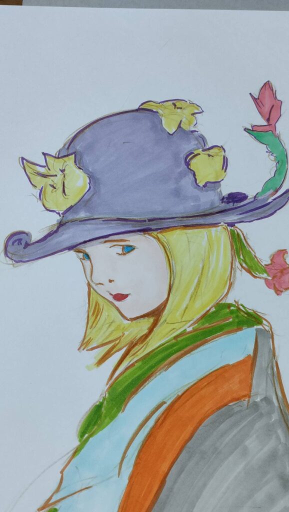
今回のイラストは、淡い感じの色合いにした。
優しい色合いがポップアートのような感じだ。
描き方はこう。
鉛筆で下書きをした後、色鉛筆で上からなぞり書き。(清書?)
鉛筆はHを使ったんだけど、あまり筆圧が強いと紙が傷ついてしまうので
優しく描こう。
B以上だと、鉛筆粉が広がったりして紙が汚れたり消しゴムで消すのも大変なので、硬い鉛筆で
消せるような下書きをしたらなお・・・良いだろう。
そのあとは軽く消すようにして、コピックで色を塗る。
ムラになってもいい。それも味だから。
後は色鉛筆なんかで上から色を塗っても良い味になる。面白いよ。
【English】
I used pale colors for this illustration.
The gentle colors give it a pop art feel.
Here's how I drew it:
After sketching in pencil, I traced over it with colored pencils. (A clean copy?)
I used an H pencil, but if I applied too much pressure I could damage the paper,
so I tried to draw gently.
With a B or higher pencil, the pencil dust would spread and stain the paper, and it would be difficult to erase with an eraser, so it's best to sketch with a hard pencil
so that it's easy to erase.
After that, I lightly erased the areas and colored in with Copic markers.
It's okay if there are some unevenness. That's part of the charm.
You can also add color over it with colored pencils for a nice touch. It's fun.